
Overview
Jobs to be Done
When people are trying to understand their health symptoms or conditions, they want quick and trustworthy medical information so they can make informed decisions about their well-being without the confusion of sifting through unreliable or irrelevant search results.
Problem Statement
Many individuals struggle to access reliable health information online. They are often overwhelmed by irrelevant search results or receive inaccurate and sometimes biased responses from general-purpose AI tools like GPT or Claude. This makes it difficult for users to find trustworthy, evidence-based guidance that is tailored to their personal health needs.
Design Hypothesis
If we create a mobile app that delivers accurate, easy-to-understand health information powered by a curated database of peer-reviewed research, then users will feel more confident managing their health and rely on it as a trusted source—much like having a personal medical assistant in their pocket.
Research
Through observational research and anecdotal evidence, we identified common user behaviors around self-diagnosing symptoms using tools like Google or ChatGPT. These methods often leave users confused, misinformed, or overwhelmed due to unreliable sources and lack of medical focus.
If you’re interested in how I arrived at the final design, keep reading to explore my process—from early user research and low-fidelity wireframes to high-fidelity designs, iterations, and usability insights. This section highlights how initial ideas evolved into a refined, user-centered solution through feedback, testing, and continuous improvement.
Project Requirements
Platform:
Mobile application: Android and iOS
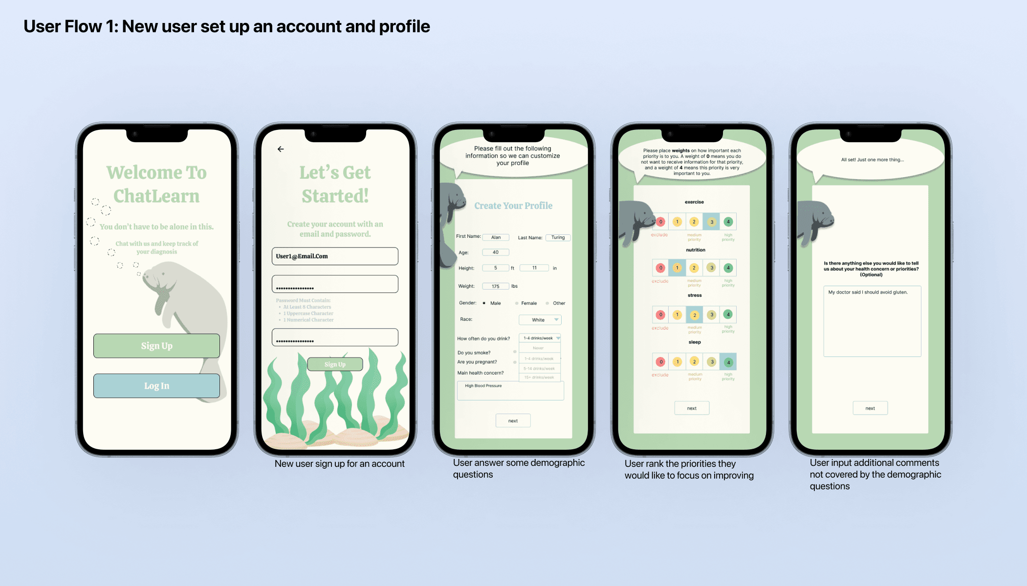
User Authentication and Profile Management:
Users must be able to log in, enter and edit profile information, and input relevant health information.
Integration with AI Technology:
The app needs to interact with an OpenAI agent created by our sponsor’s lab, allowing users to send and receive chat queries.
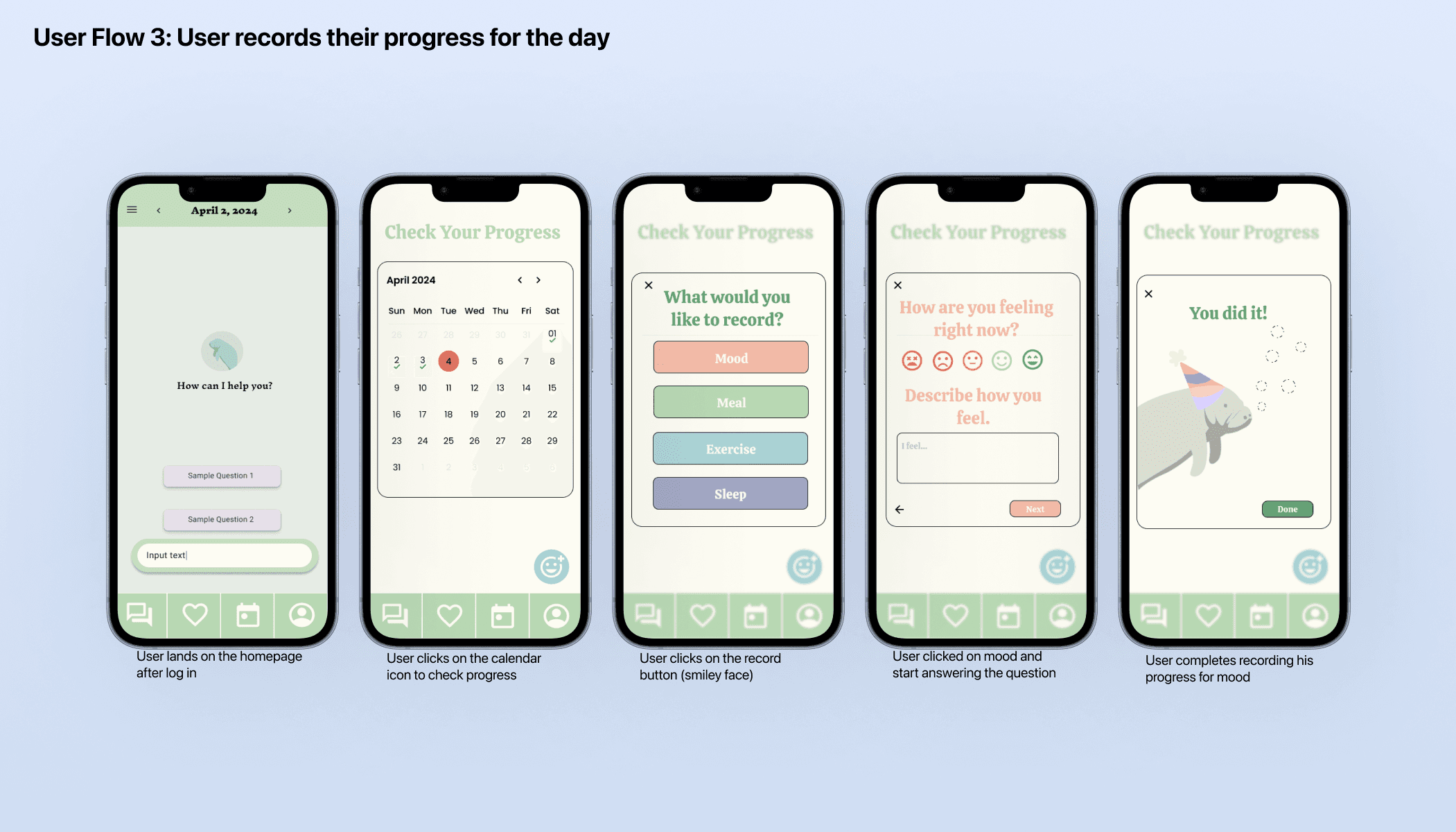
Daily Interaction and Engagement:
Conversations with the chatbot (OpenAI agent)
Record daily progresses
Rank priorities(stress, diet, sleep and exercise)
Favorite and view chat conversations
View/Edit user profile.
Research Process
1. Methods & Rationale: To align with sponsor expectations, we conducted a design reference analysis using the Noom app, which was suggested as a visual and functional benchmark.
Our focus was on Noom’s layout, user flow, and calming aesthetic, which guided our approach to user interface design.
While formal user research was not conducted due to constraints around scope and timeline, this competitive analysis allowed us to establish design principles grounded in existing, successful health apps.
2. Pain points Identified:
From secondary research, sponsor feedback, and analysis of common issues with general AI tools, we identified the following key pain points:
Information Overload: Users often receive an overwhelming volume of search results when seeking medical information.
Low Trust in AI Responses: General-purpose AI tools like GPT and Claude can produce biased or inaccurate health advice.
Lack of Personalization: Existing platforms fail to tailor responses to individual user profiles or health goals.
Poor UX for Health Guidance: Many tools lack a calming, approachable interface that makes medical self-education feel safe and manageable.
3. How my solution addresses these pain points
Our solution, ChatLearn, was designed to directly address these challenges:
Curated Knowledge Base: Unlike broad AI models, ChatLearn pulls from a verified database of scholarly health articles, ensuring reliable, evidence-based information.
Personalized Interaction: ChatLearn acts like a home medical assistant, offering customized responses based on user input.
Simplified, Calming UI: Inspired by Noom’s design principles, the app presents information in a visually calm, user-friendly format, reducing cognitive load.
Pre-Wireframing
Met with our sponsor to understand the core technical requirements and overall project goals.
Given full creative freedom as part of our senior computer science capstone, allowing us to shape the product vision and UX direction.
Researched the Noom app to analyze its layout, user flow, and calming visual style, which informed our design tone.
Defined a clear design goal: create a user-friendly and technically feasible mobile app that supports users in managing their health through trustworthy information.
Brainstorming
Introduced a custom mascot (a manatee) to create a comforting and approachable brand personality.
Prioritized accessibility, including a color palette that is friendly to color-blind users.
Minimized text to improve clarity and emphasized visual communication for a more digestible experience.
Finalized the color palette and divided design tasks across three teams.
Personally led the design of the chatbot and all the features on the chatbot page.
Wireframing
Created initial wireframes for key screens: sign-in, login, profile creation, chatbot, and progress tracking.
Focused on intuitive navigation and a seamless user experience.
Completed most of the foundational UI before Iteration 1 began.
Iterative Design & Development
Our team followed a three-iteration process:
Iteration 1 focused on finalizing the complete set of UI designs to prepare for implementation.
Iterations 2 and 3 shifted focus to development and testing, but design refinement continued throughout, as sponsor feedback and evolving requirements led to ongoing changes.
Each iteration involved syncing with the sponsor, evaluating progress, and making necessary adjustments to improve usability, meet technical constraints, and stay aligned with project goals.
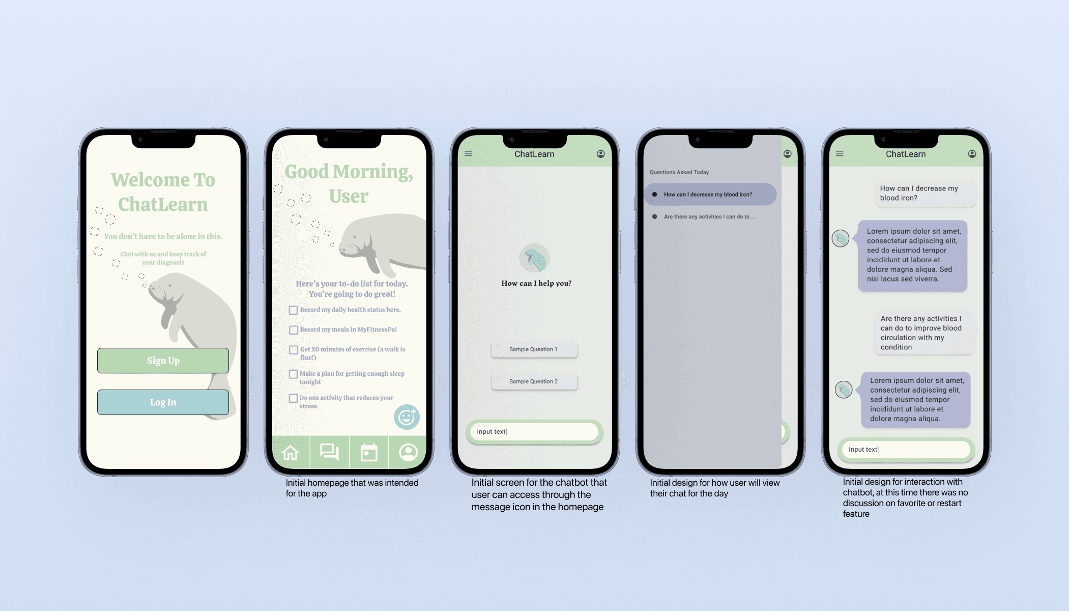
📝 Sponsor Feedback
After reviewing our initial wireframes, the sponsor was generally satisfied but later requested additional features:
⭐ Favorites Page
📜 Chatbot History and restart
📊 Priority Ranking
We also updated the user flow to make the chatbot the default landing page, ensuring quicker access to the app’s core feature.
User Feedback - Posters & Pies
Event Overview
Presented the app at the "Poster & Pie" showcase.
Attendees included a diverse group: peers, professors, parents, children, and elderly individuals.
While not a formal usability test, this hands-on session allowed for informal but valuable feedback.
Positive Feedback
Users found the app intuitive, easy to use, and visually engaging.
Many expressed interest in downloading the app if made available on the App Store.
The straightforward interface appealed to users across various age groups.
Constructive Feedback
Some users noted that the text size could be improved for better readability.
A few minor technical issues were observed during interactions.
Overall Impression
Feedback confirmed that the app is accessible, user-friendly, and well-suited for a wide audience.
The event validated the effectiveness of our design direction and highlighted areas for future improvement.
Due to timeline constraints, the final design excluded several features from the original requirements. However, we prioritized and delivered the core functionalities: user login, profile setup, a chatbot for medical questions, and the ability to record daily health progress. The interface was designed to be intuitive and straightforward, ensuring users can easily navigate the app and access key features without confusion.


Future Enhancement
For future enhancements, we aim to include features excluded from the original requirements. This will allow us to make the app more curated and customizable for users, based on their demographic information and health conditions