Redesigned key experiences in a subscription fitness app to help paid users better understand and use their premium benefits. Through two internship projects, I improved feature discoverability in the Elite Hub and streamlined access to support across web and mobile.

About the product
Fitness app that allows users to plan workouts, follow training programs, and track progress:
Core features are available to free users, with advanced tools unlocked through an Elite membership
Elite features include workout customization, analytics, and tools that support long-term progress
Primary users: Fitness enthusiasts ranging from beginners to advanced lifters
Overview: Elite Hub Revamp
Jobs to be Done
When users upgrade to Elite (premium), they want to clearly understand what benefits and features are included with their subscription so they can fully take advantage of the value they’re paying for. Instead of feeling unsure about what’s available or missing out on features they didn’t know existed, they want a centralized, easy to navigate hub that explains their benefits and highlights tools that can enhance their workout experience.
Problem Statement
The existing Elite Hub primarily functioned as a tutorial, focusing on where features were located rather than what users could gain from using them. Benefits were presented as a long, stacked list with little categorization, making it difficult for users to understand the purpose of each feature or prioritize which ones to explore. As a result, premium users lacked clarity around the value of their subscription and were less likely to engage with features that could meaningfully enhance their experience.
Design Hypothesis
If Elite benefits are reorganized into clearly defined categories and reframed around the value each feature provides rather than instructional steps then users will more easily understand what their subscription offers, identify features that align with their goals, and feel more confident exploring underused premium tools, ultimately increasing engagement with the Elite experience.
Research
To better understand how Elite users interacted with the existing Elite Hub, I analyzed behavioral data using Amplitude. The goal was to identify which Elite features users engaged with most frequently, which features were underutilized, and how users behaved after entering the Elite Hub.
If you’re interested in how I arrived at the final design, keep reading to explore my process—from early user research and low-fidelity wireframes to high fidelity designs, iterations, and usability insights. This section highlights how initial ideas evolved into a refined, user centered solution through feedback, testing, and continuous improvement.
Project Goals & Requirements
Promote new and underused Elite features through clearer organization and value-driven presentation
Redesign the existing Elite Hub experience end-to-end
Improve engagement within the Elite hub by helping users better understand their premium benefits.
Allows the users to check their subscription information on the elite hub.
Ensure the new designs align with the updated design system by consistently using standardized components, layouts, and interaction patterns.
Constraints
The existing Elite Hub experience was outdated and required a complete redesign
Time and feasibility constraints: The redesign needed to align with the company’s rebranding timeline, reuse existing components, and minimize engineering effort while keeping core user flows stable.

The direction of the Elite Hub revamp was shaped through three collaborative design reviews with the product and design teams:
Design Review 1 - Defining the direction: Focused on defining the purpose of the Elite Hub and aligning on what the experience should achieve. Discussed whether the Elite Hub should function as a tutorial-based experience or an informational, value-driven hub. The team aligned on prioritizing value communication over instructional content.
Design Review 2- Evaluating structure and intent: Five low-fidelity concepts were explored, and one direction was selected to move forward.
Design Review 3 - Refinement and finalization: Finalized high-fidelity designs and prototypes, refining layout, hierarchy, and feature grouping to ensure clarity and ease of discovery.
These discussions led to a clearer information hierarchy, stronger categorization of Elite features, and a shift toward communicating what users gain from each feature rather than simply where to find them.
Future Enhancement


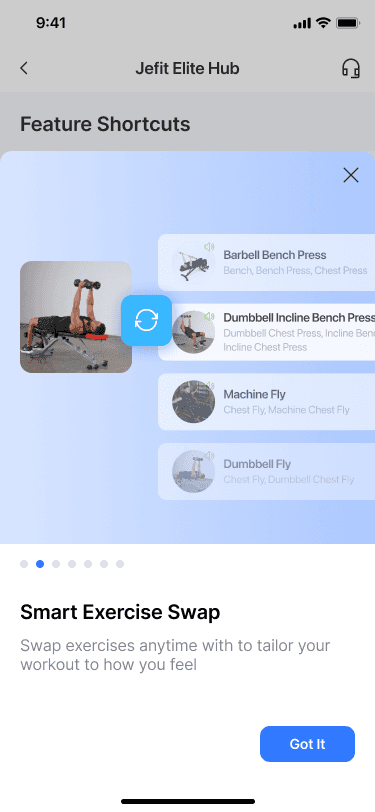

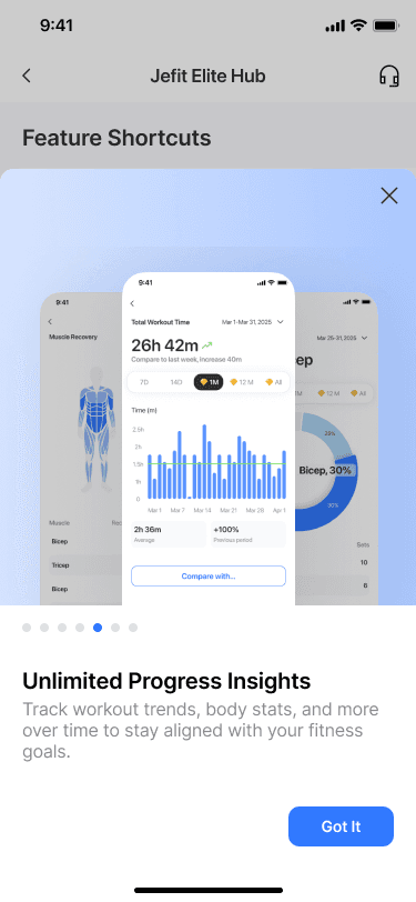
This direction was selected to balance clarity, discoverability, and ease of exploration while aligning with the goal of helping Elite users better understand their premium benefits. A categorized layout paired with a horizontally scrollable promoted section surfaces high-value and underused features without overwhelming users. Simplified iconography and refined color accents reinforce a premium feel while keeping the interface easy to scan. Feature details are presented through focused overlays that explain one feature at a time, allowing users to quickly swipe between features and take action without navigating across multiple pages.
Future iterations could explore additional ways to surface and promote Elite features, such as testing alternative layouts or placements that further encourage discovery. There is also an opportunity to reduce or condense feature content to minimize excessive scrolling while still clearly communicating the value of each benefit. Additionally, introducing personalized feature recommendations based on user behavior could help highlight the most relevant Elite tools for each user and further improve engagement.
Overview: FAQ Page
Jobs to be Done
When users have questions or encounter issues while using the app, they want a clear and dedicated place to quickly find answers to common questions. Rather than searching through blog posts or product update content, they want an FAQ experience that is easy to scan, focused on support, and designed to help them resolve issues efficiently without disrupting their workflow.
Problem Statement
The existing FAQ experience was outdated and lacked a clear identity as a support resource. There was no dedicated space for frequently asked questions, and the majority of content consisted of blog posts and product updates rather than help-focused articles. As a result, users had difficulty finding answers when they needed support, and the absence of clearly defined FAQ content increased friction and reduced the effectiveness of the help experience across both web and mobile platforms.
Design Hypothesis
If a dedicated FAQ page is designed specifically around common user questions and separated from blog and product update content, then users will be able to more easily find relevant answers when seeking help. By prioritizing clarity, scannability, and consistency across web and mobile, the FAQ experience can better support users in resolving issues quickly and confidently.
Research
To better understand what content should be included in a dedicated FAQ experience, I reviewed questions and concerns raised by users within the community feature and analyzed recurring themes. I also conducted a competitive review of FAQ experiences across similar fitness and consumer apps to identify common questions, pain points, and content patterns. This research helped inform which topics should be prioritized and how FAQ content could be structured to better support users across web and mobile.
If you’re interested in how I arrived at the final design, keep reading to explore my process—from early user research and low-fidelity wireframes to high fidelity designs, iterations, and usability insights. This section highlights how initial ideas evolved into a refined, user centered solution through feedback, testing, and continuous improvement.
Project Goals & Requirements
Design a dedicated FAQ experience for both web and mobile platforms
Establish the web version first and adapt the same structure for mobile to ensure consistency
Create a simple, scalable layout that supports common user questions and future content growth
Constraints
Due to timeline considerations, the FAQ design needed to be lightweight and straightforward enough to be implemented within a single development day.
The product team had not yet defined the scope or length of FAQ content, requiring the design to remain flexible and adaptable to varying question formats.
Limited visibility into finalized FAQ questions meant the design needed to accommodate unknown content while still providing clear structure and usability.
Iteration 1: Explored multiple FAQ layout options with a focus on simplicity and scalability. Through discussions with the product team and engineers, we aligned on removing unnecessary features such as category landing pages and search, prioritizing a straightforward structure that mirrors common FAQ patterns and could be implemented quickly.
Iteration 2: Refined the selected direction into high-fidelity wireframes and established a flexible layout framework that could be easily customized once FAQ questions and content were finalized, ensuring long-term scalability without additional redesign.
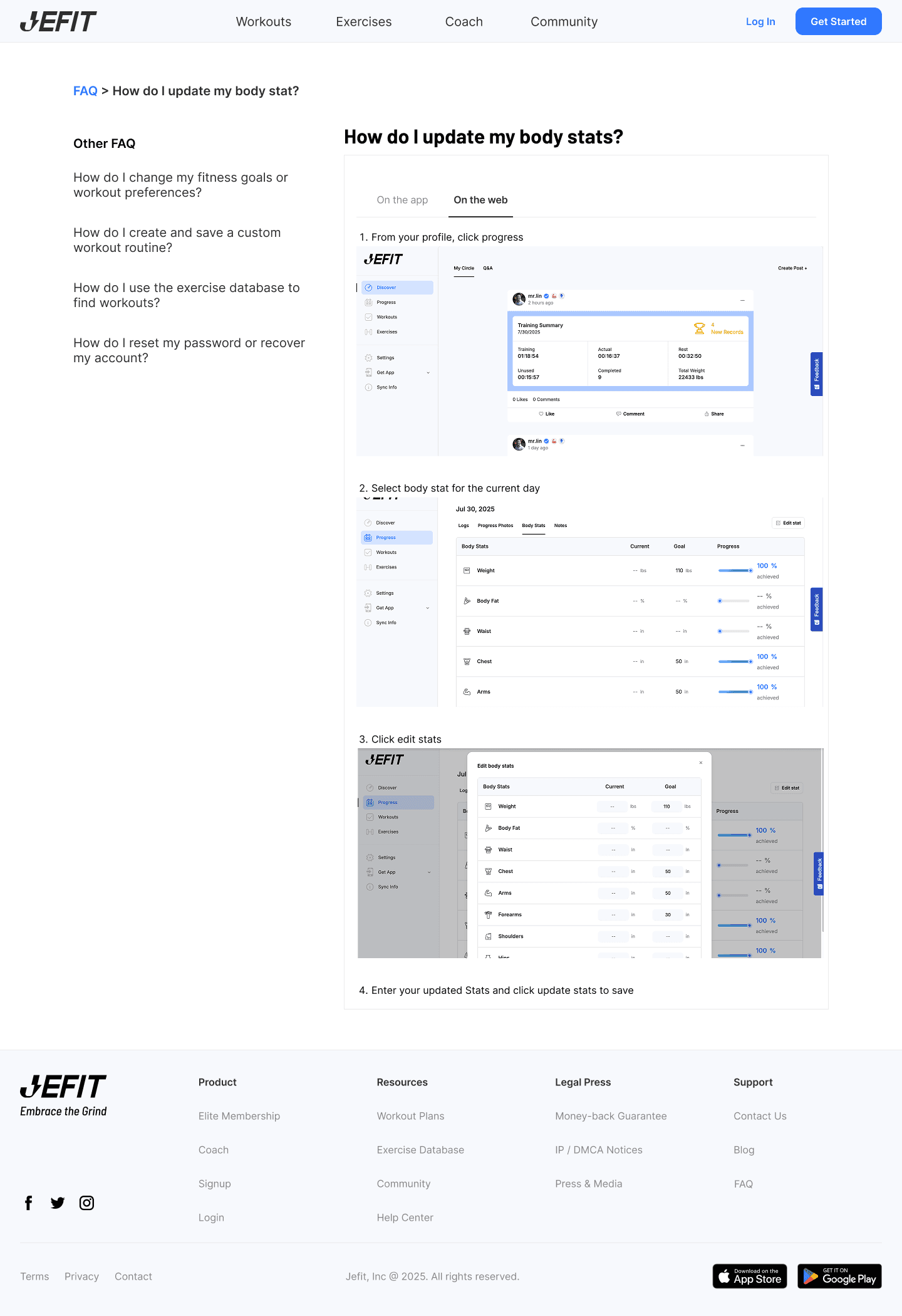
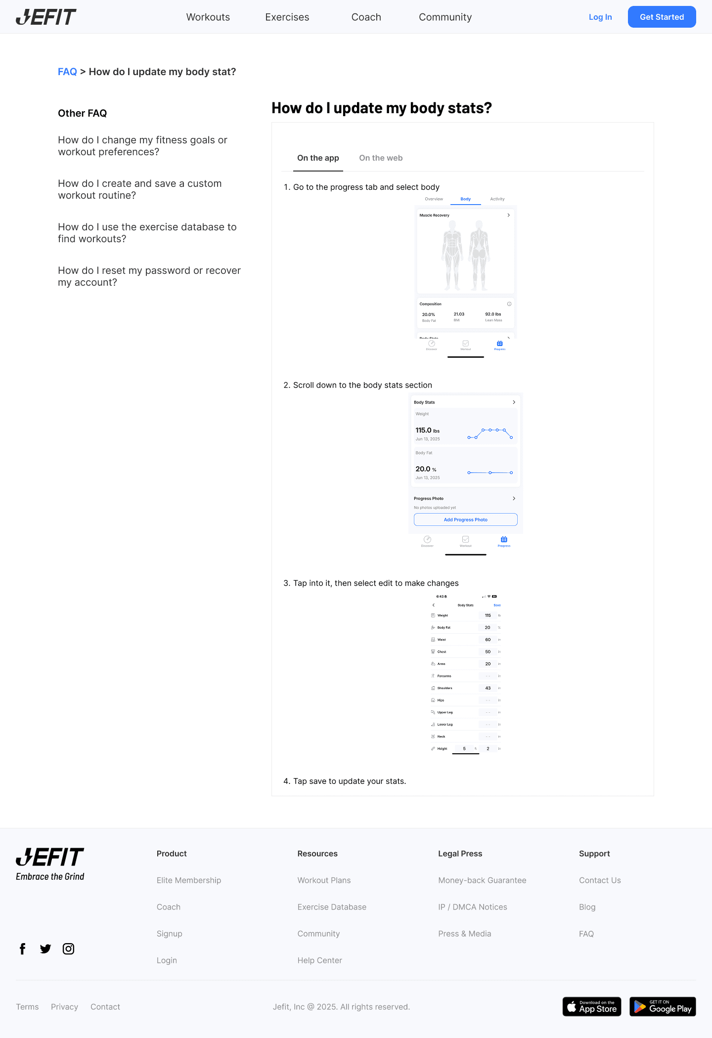
The final FAQ design prioritizes simplicity and scalability to support quick implementation and future content growth. A familiar, straightforward layout was intentionally chosen to align with common FAQ patterns, reducing user friction and ensuring the experience would feel intuitive without additional learning. By avoiding unnecessary features such as category landing pages and search, the design remains lightweight and easy for engineering to implement within a short timeline. The resulting layout establishes a flexible framework that can be easily customized and expanded once FAQ content is finalized, while maintaining consistency across both web and mobile through responsive resizing.


Future Enhancement
As FAQ content becomes more defined, future iterations could explore introducing lightweight categorization or filtering to help users navigate a growing set of questions more efficiently. Additional enhancements may include adding a search function once the volume of FAQ content increases and user behavior supports the need for it. With more usage data, the layout could also be refined to prioritize the most frequently viewed questions and improve discoverability across both web and mobile.